Perceptive Films
A brand identity for a film production company.
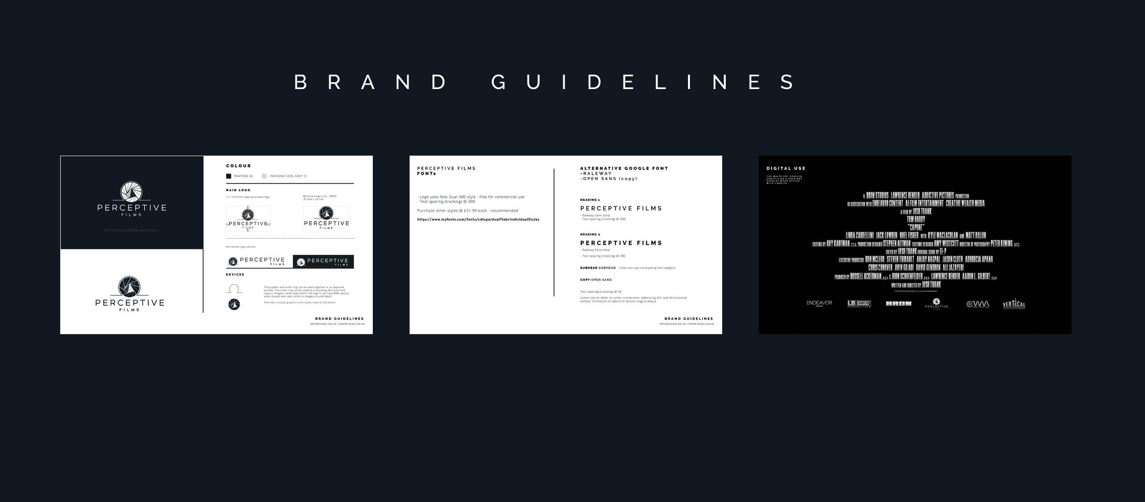
BRAND IDENTITY & STYLE GUIDELINES
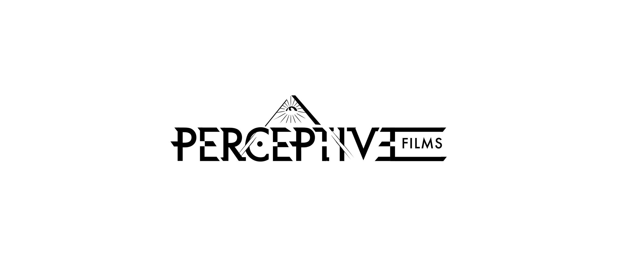
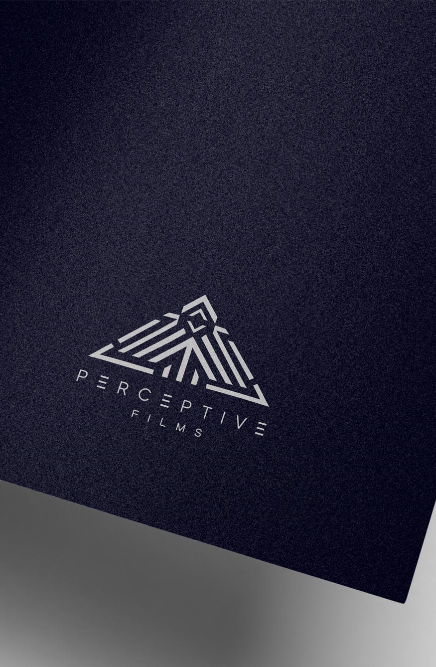
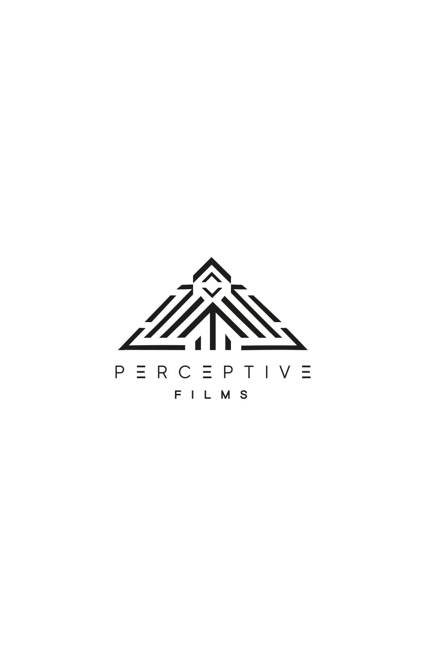
The company requested a logo and style that utilised the the Eye of Providence which depicts an eye often enclosed in a triangle and surrounded by rays of light or Glory. The production produces documentary content that is anarchic, intelligent and rebellious so the challenge was to create a striking alternative that is inspired but does not directly replicate the 'eye in the triangle' image. A range of versions were presented, with a thorough exploration of typography, mark making and image styles. The chosen logo shows the eye in the triangle in reverse where the triangle is put inside 'the eye' using a circular, Escher style device. The 'rays' are the shutter in a camera lens that engulfs it. A true reflection of the power of concept in logo design.

The concept stage was a thorough exploration of the themes that could be utilised and reflected in the identity.