Periphony
Digital creative direction, UI and app icon design for Periphony
APP ICON/ LOGO
UI UX SITE DESIGN
ART DIRECTION
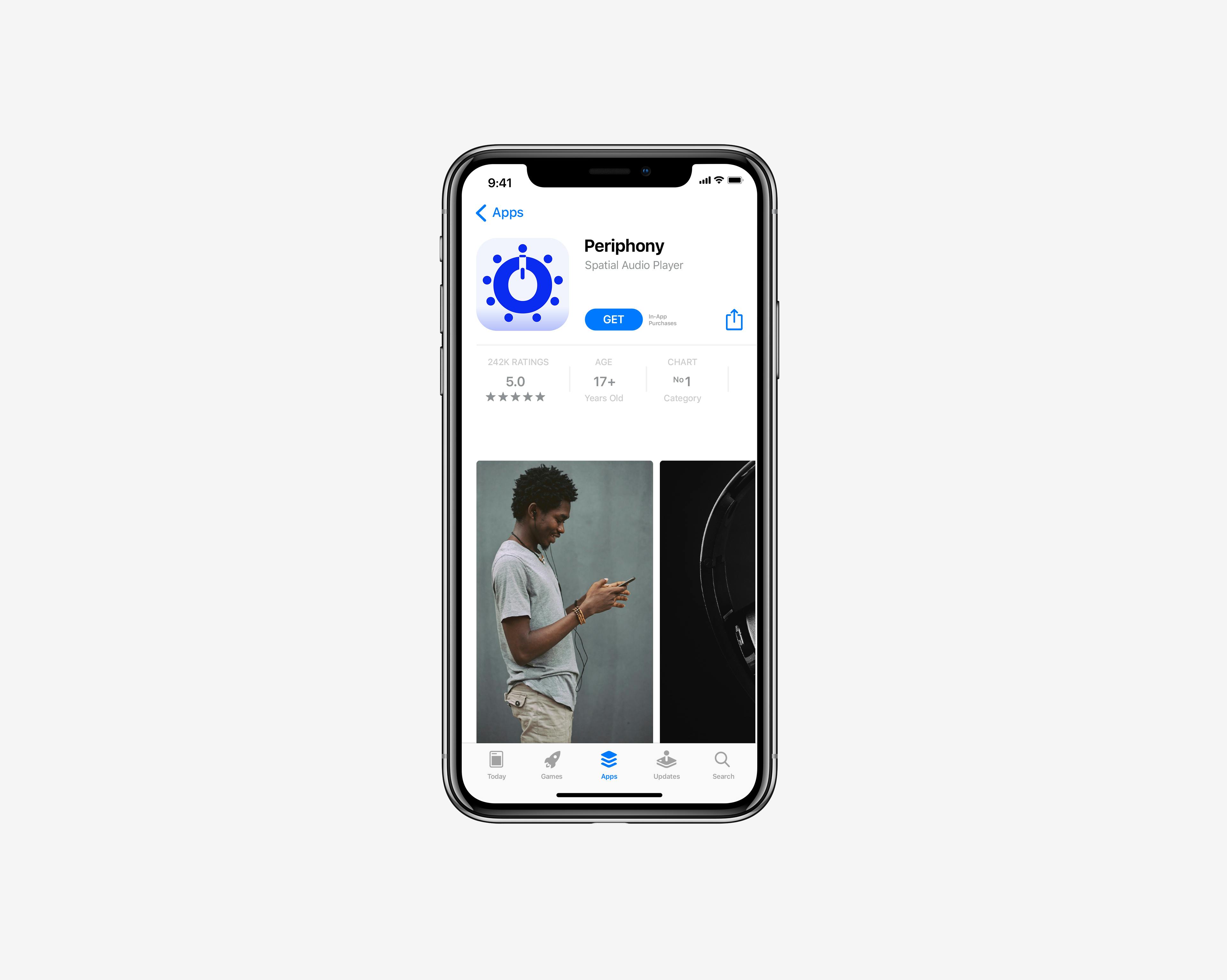
Create a distinct icon to represent Periphony on the App store. An app that plays high order Ambisonics files with head-tracked binaural rendering on iOS and macOS for audio professionals. Once the App was nearing completion I worked with the app founder and creator Ollie Larkin to offer creative support including name generation, strategy, logo / app icon, website design and creative direction. The icon

The icon and it's story
The chosen logo incorporates 4 key elements that define the story of Periphony. As the App is for headphone only playback, this was the chosen visual to use. The headphone is formed from the 'O' of the typography, and also resembles a volume button. If the icon is rotated this transforms into an apple Airpod which are commonly used to transmit the spatial sound from the Periphony renderer as well. The fixed points resemble the sound planes of the geodesic dome structure used in 3D sound production, as well as communicating the spatial sound effect. These are all glossed with the electric blue colour within the app interface.

Where did it start
The client was nearing completion working with a developer to build the app and I was brought in to consult on further creative direction, UI and iconography. The UI was using a black and white palette only so we introduced an additional electric blue colour to the WAV visualiser and to use this as the primary brand colour. This gives the brand look a bit more punch and works well for overlays and buttons. Blue is a prominent colour in visualisers that use RGB colours for sound scapes.
Working with the client to decide on brand names Periphony was born. I developed the app icon, typography, brand and website style. Some of these key themes stood out during the concept stage:
Headphones only app
Works on ipad, phone + desktop 3d sound
Renderer not player - this would rule out any play button imagery
Fixed sound spots - could define a circle pattern
Human generated experience - add a human visual element.
The concepts stage revealed a number of routes, I narrowed them down to a selection to present the client. As the app is a renderer not a player, the play button was scrapped. Key themes were headphones, a circle shape, contrast and a 3D element. Particularly ‘Pod Play’, ‘Spatial human’ and ’Love the Lebedev’ which were front runners.


Through ambisonics research and client questionnaires, I started to draw the imagery which we could use for the icon.

Other routes explored using the headphone and how we can convey the spatial sound element with a circular device or Geodesic dome structure.


Typography
Looking for a modern technical typeface with a twist, the Y of the typography shape is inspired by a tuning fork, and the O is used to create a headphone emblem. I also explored joining the n and the y to mimic a soundwave. After much exploration, typeface Museo Moderno worked perfectly.
