Swan Children's Homes
An illustrative, versatile approach to branding a home for children with Autism and learning disabilities.
LOGO & BRAND GUIDELINES
ILLUSTRATION
Swan Children’s Homes is a sister company to Swan Independent Living (providing residential accommodation for asylum seekers). The brief entailed designing a logo and an illustration style for their new care home. The design was to convey the experience and reputation they have for caring for children, combined with the swan motif from the Independent Living logo. The use of font, colours, brand graphics and style would be applied to the new, therapeutic children’s services materials and support any future homes styling.
The natural landscape and the natural habitat were key in supporting a brand style that would also work for the specific audience of children in care. Researching colour and the best practice in autism design, I used a palette with low arousal colours, using no patterns, and positive natural imagery for children with autism and learning difficulties
Sister Company logo
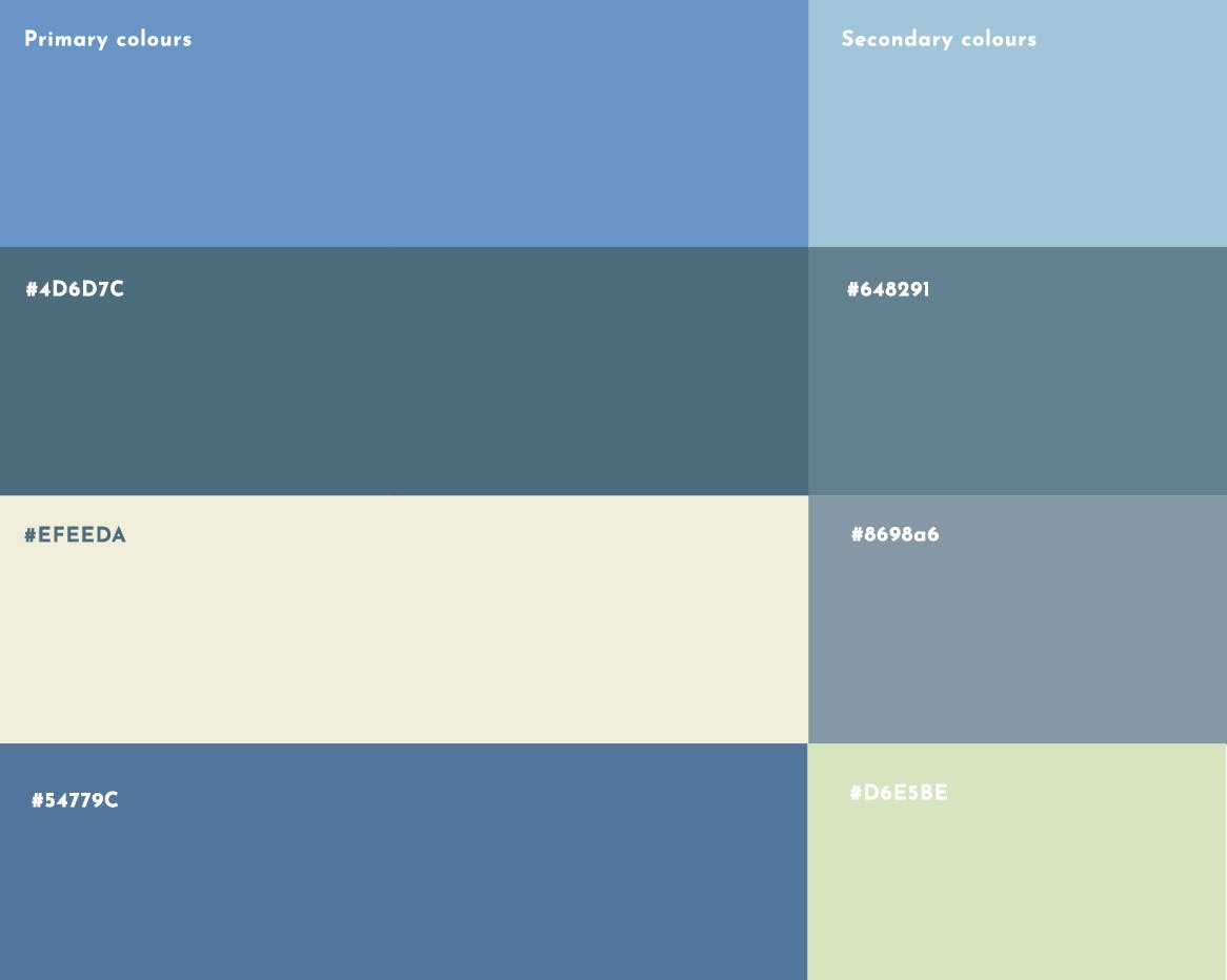
The palette has a balance between grey, blue and green while avoiding stimulating colours to evoke calmness for children with Autism. The colours were used to guide the feel of the Swan logo.
The logo
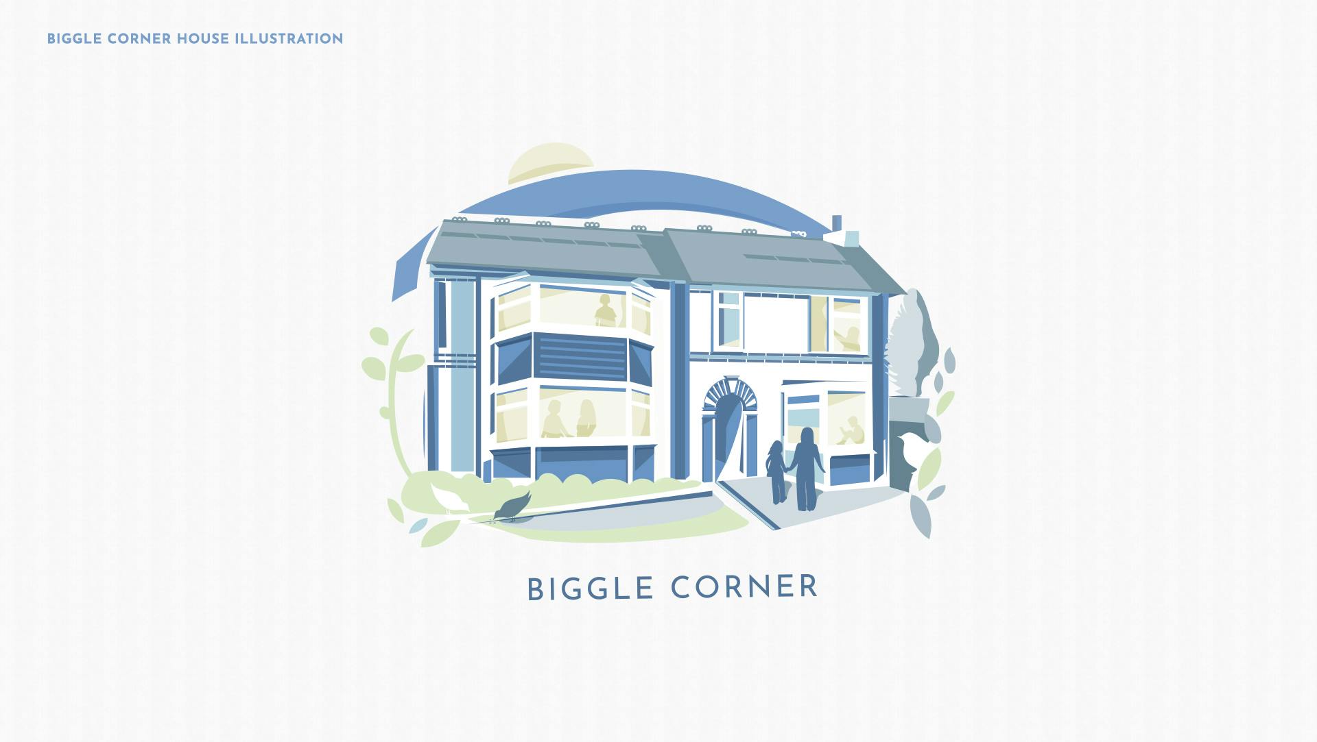
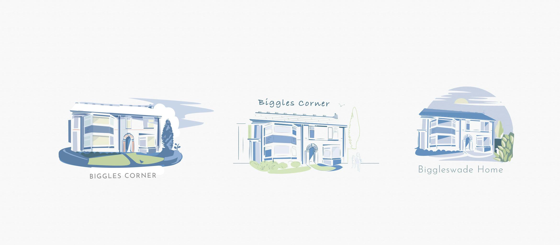
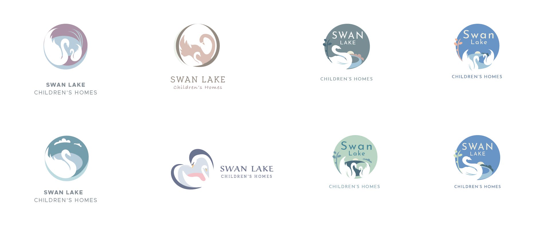
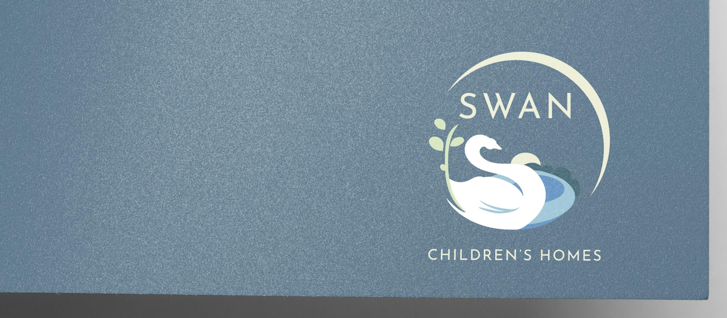
The brand logo and identity should be recognisably similar to Swan Independent Living but using the blue/grey colour palette. Using the swan design as a guide I created a calm, caring aesthetic with a picture book style. Images are uncluttered using natural landscape features and fun shapes understood by children such as clouds and trees. The designs below were earlier concepts exploring composition and colours playing with single or multiple swans.
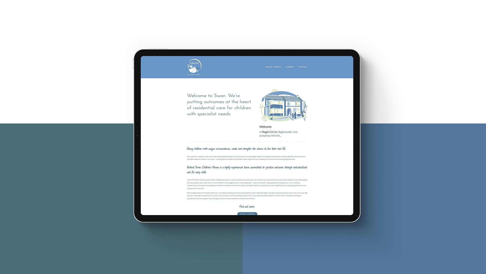
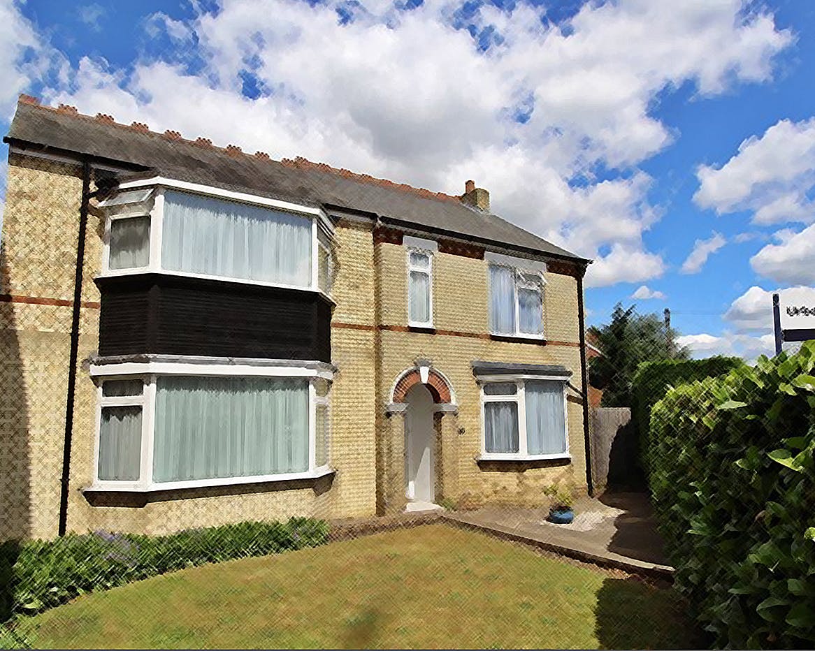
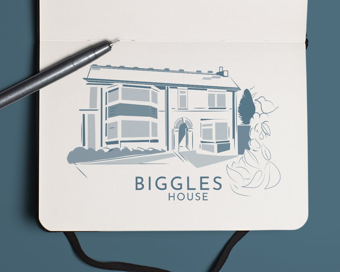
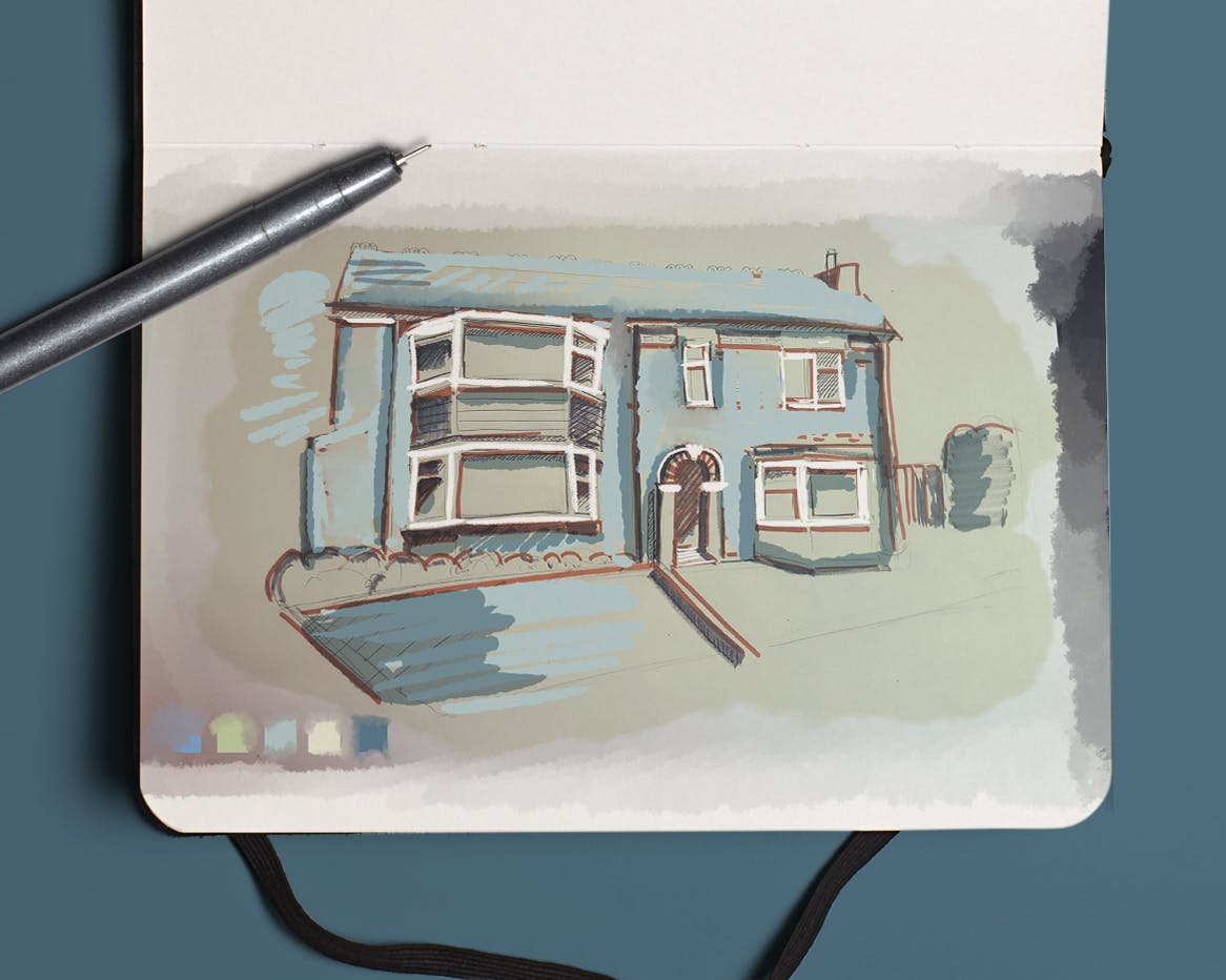
Nearing the project's completion the name changed to ‘Swan’ and the chosen logo was adjusted. It uses a single swan motif against a serene blue background surrounded by a pleasant landscape. Versions were adapted for dark backgrounds and a guidelines document with the colour codes, the Biggle Corner illustration and fonts helped steer the design of the website.
The softness of the colours combined with the natural imagery creates a relaxed and calming feel to the brand. The colours chosen can be mix and matched to give flexibility to designs.