Nexio
A new start-up company needing a visual language for quick expansion.
BRAND DEVELOPMENT
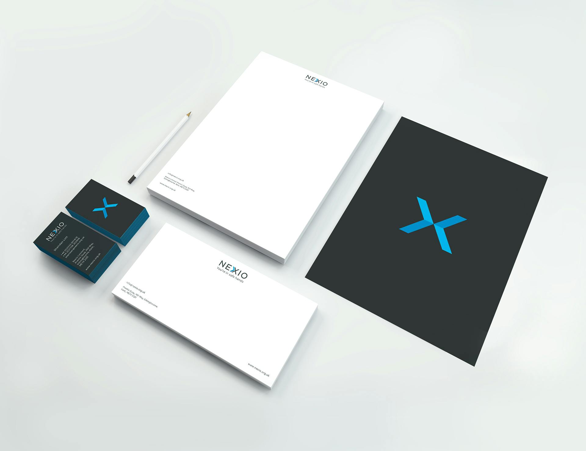
STATIONARY & LITERATURE
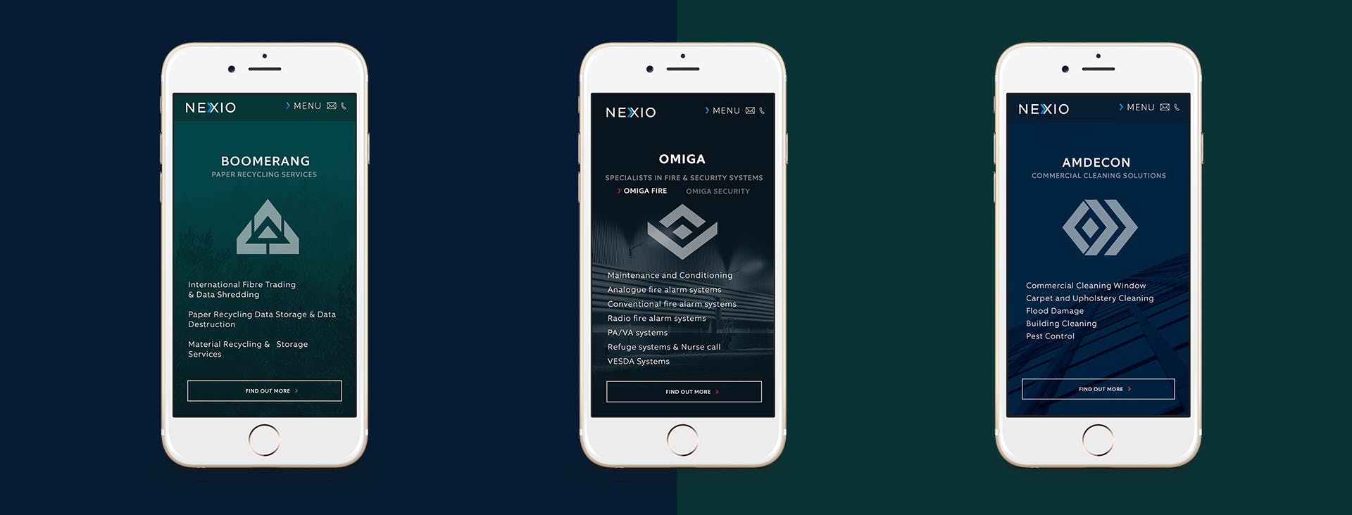
WEBSITE & MOBILE DESIGN
Nexio are a start-up facilities management company, and the purpose of their branding was to show they are modern, progressive and reliable. They needed an identity system which would allow scope for more logos to be designed as they expanded their services, and were consistent in look and feel. I took inspiration from the X of Nexio. By cutting the X in half an arrow shape is created. This device was applied to create various different patterns which could then be applied to the various companies. The arrow could then be manipulated into multiple logos to create an iconic and simple branding system.


Facilities management

Commercial cleaning

Waste management

Fire alarm systems
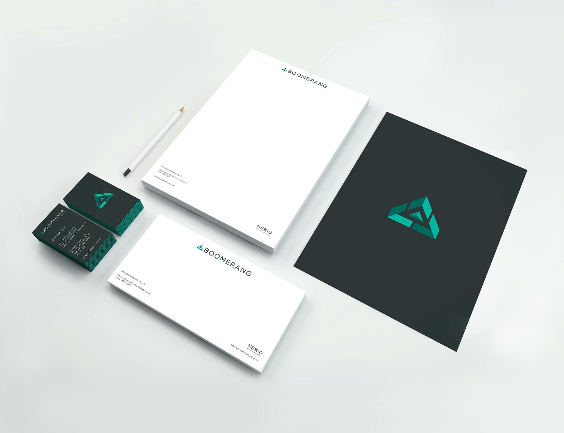


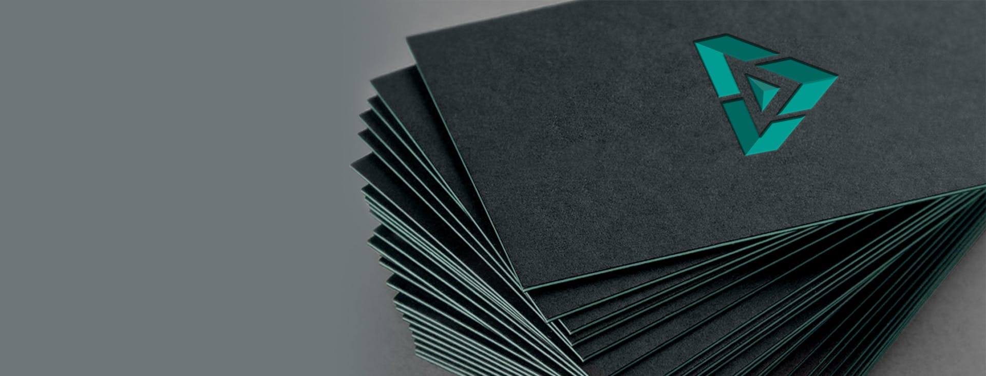
The logo within the business cards is created with a die cut. Then layers of coloured card are cut into sections to make up the logo. Example below for Boomerang.
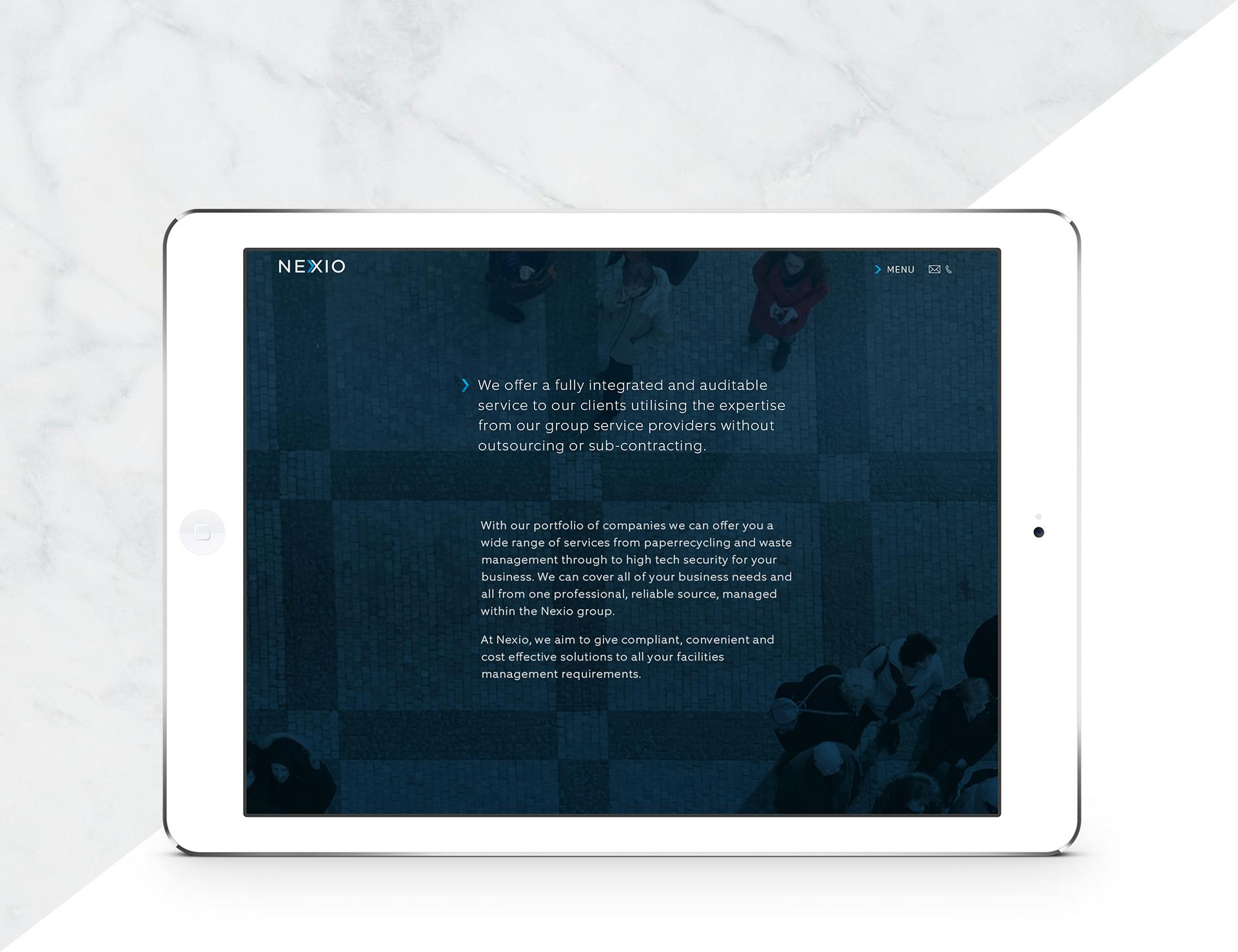
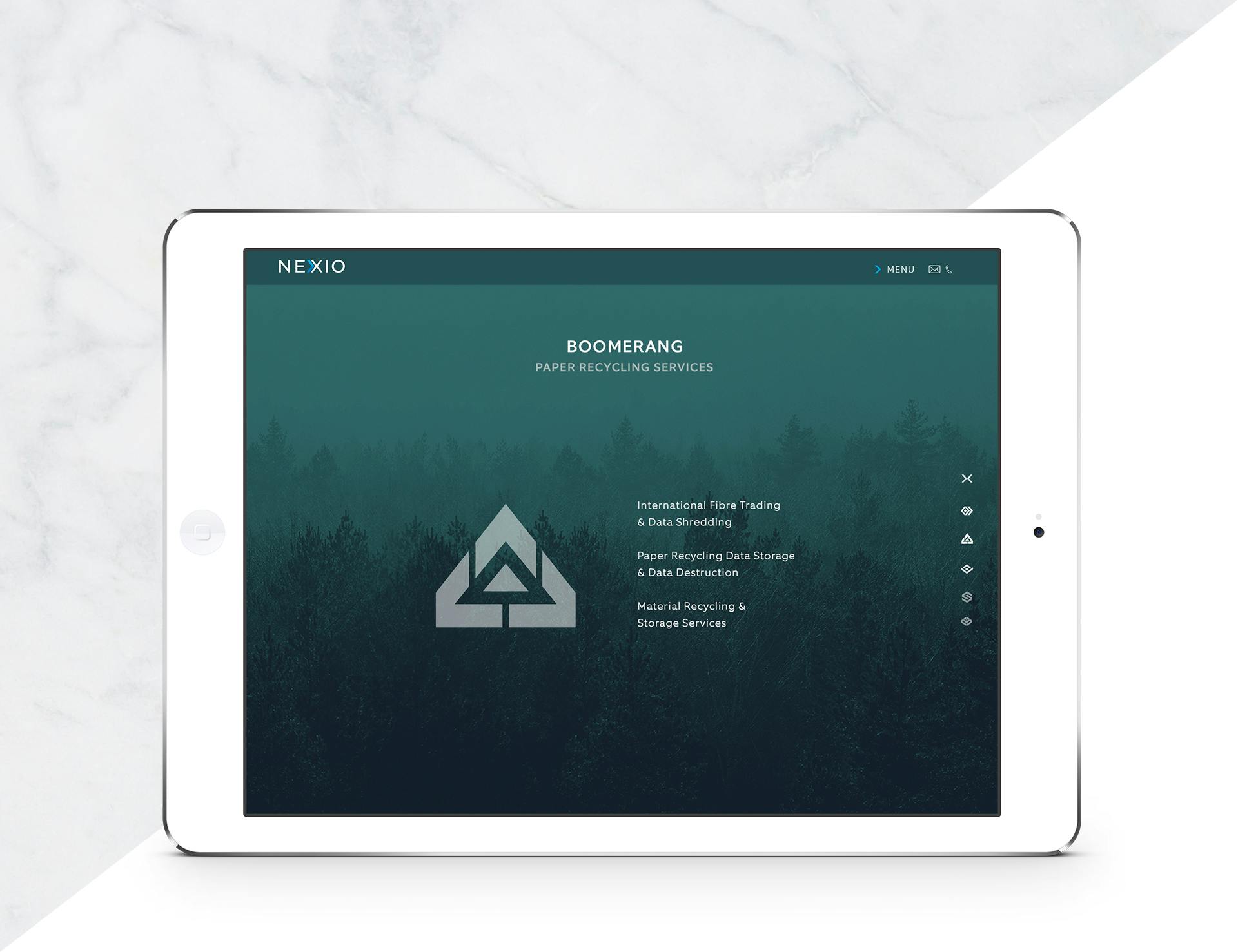
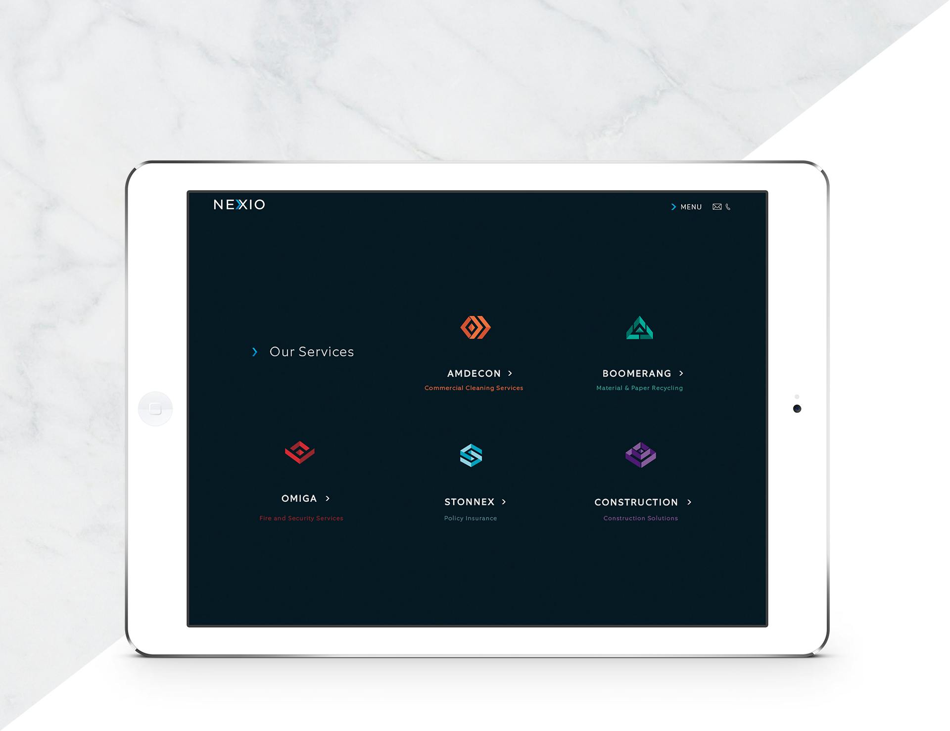
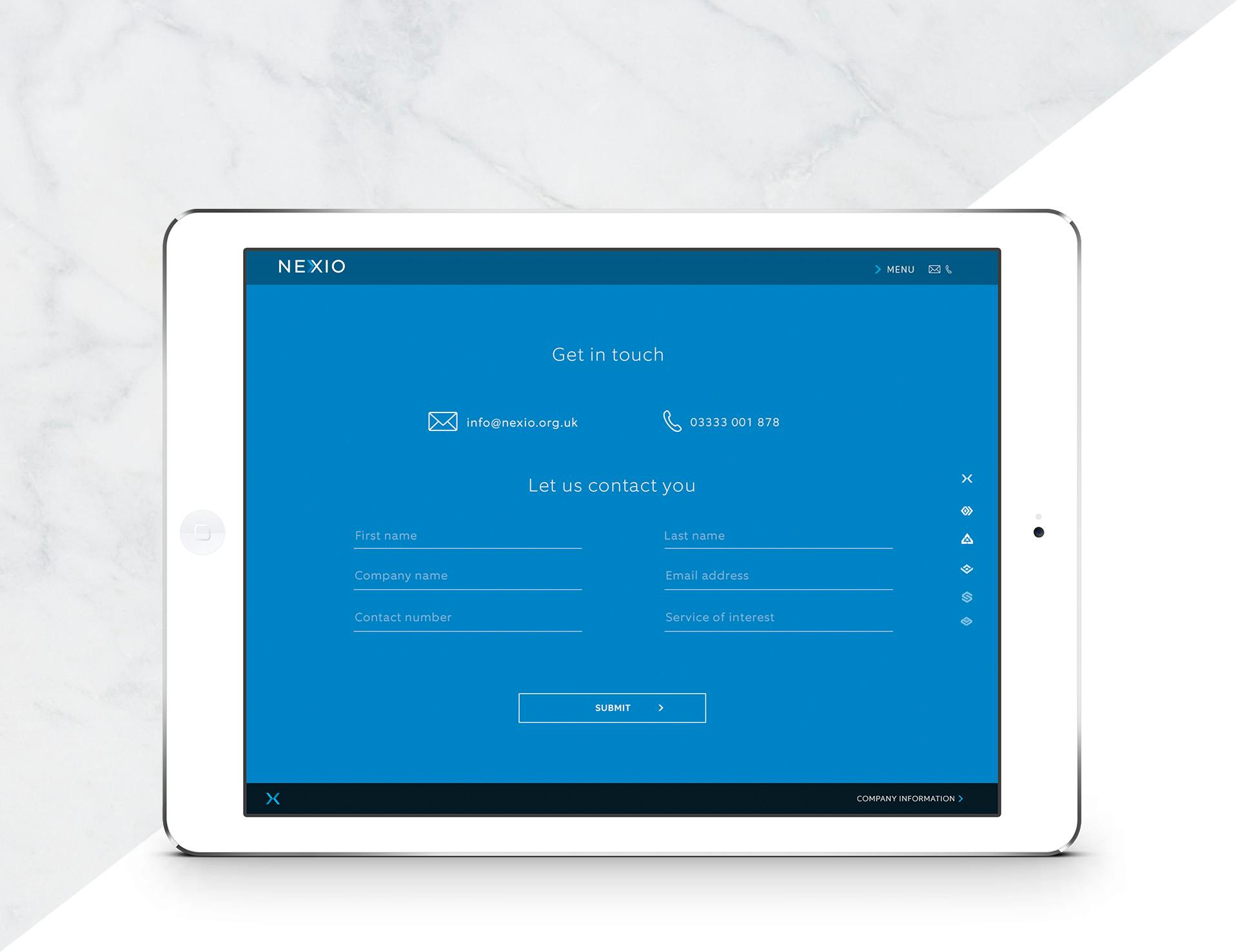
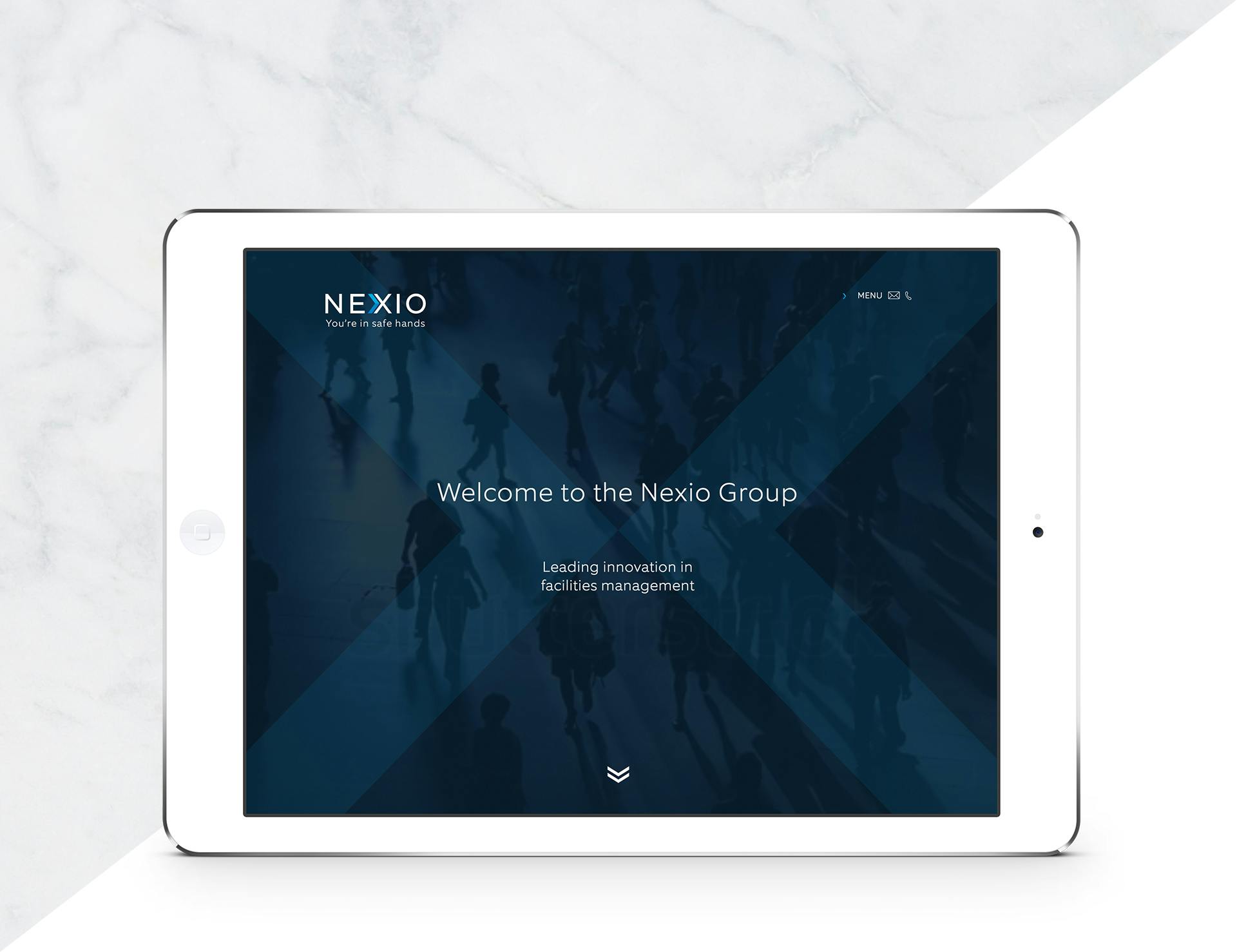
The Nexio site
The responsive website is a hub that holds all the information relevant to each of the services. It needed to be clean, easy to navigate and modern. The imagery that I chose to represent the various services was used as a background for each of the pages, and the logo created a striking graphic as well as an additional navigation system on the right as you scroll down the page. I enjoyed working with the developer adding the animation touches and video that enhances this digital platform.